My Design Process of the Watercolor Christmas Pattern Collection
You probably heard from my Substack newsletter that I recently launched this new Christmas pattern collection. This is my first pattern collection which was created with traditional watercolor and Photoshop.
I have used Photoshop for some projects before, yet I’m much more efficient with Adobe Illustrator. However, because my vision for this collection is that nostalgic, vintage textured watercolour look, I chose to take the little challenge of using Photoshop for this work. This has been a wonderful learning experience that levelled up my Photoshop game. Now, I love using Photoshop as much as Illustrator and will definitely create future collections in Photoshop.
As a designer in this technology era, to ensure growth, you must constantly take on new challenges to learn new programs and level up your skills. What is the one thing you know you need to do that requires you to step out of your comfort zone? Name it, and then do it! You’ve got this! :)
The design process of the collection was a long one. I set out to create a Christmas collection in July. Yes, you read it right. July. I painted a watercolor winter bouquet using the Christmas color scheme to set my mental space for the work. However, my kids’ summer holiday was only days away, and we had planned this Europe trip, which we were all excited about. I just couldn’t bring myself to go any further with this project.
The watercolor winter bouquet I painted to kick off the collection creation process
When we returned from our holiday in September, and the kids started the school year, I finally had the time to revisit my vision for this collection.
I first brainstormed the ideas, motifs, and vibes for this collection. I jotted down words. I also used Chat GPT to generate more ideas. Then, I narrowed it down to about 8 ideas. Because I already had a watercolor winter bouquet painting that I loved, and because I really didn’t want to drag the process any longer, I decided to keep it simple—to create the whole collection around the elements of the painting and adding one or two new ones.
Brain-storming ideas for this collection with the help of Chat GPT
Hope you will enjoy a little painting tutorial of a pinecone below. :)
The church bell in the ogee border was the first print I created. Because of my Christian faith, I intentionally wanted something that could relate to the essence of Christmas—for me, it’s the celebration of the birth of Christ. I love this bidirectional print, perfect for something like a girl’s dress.
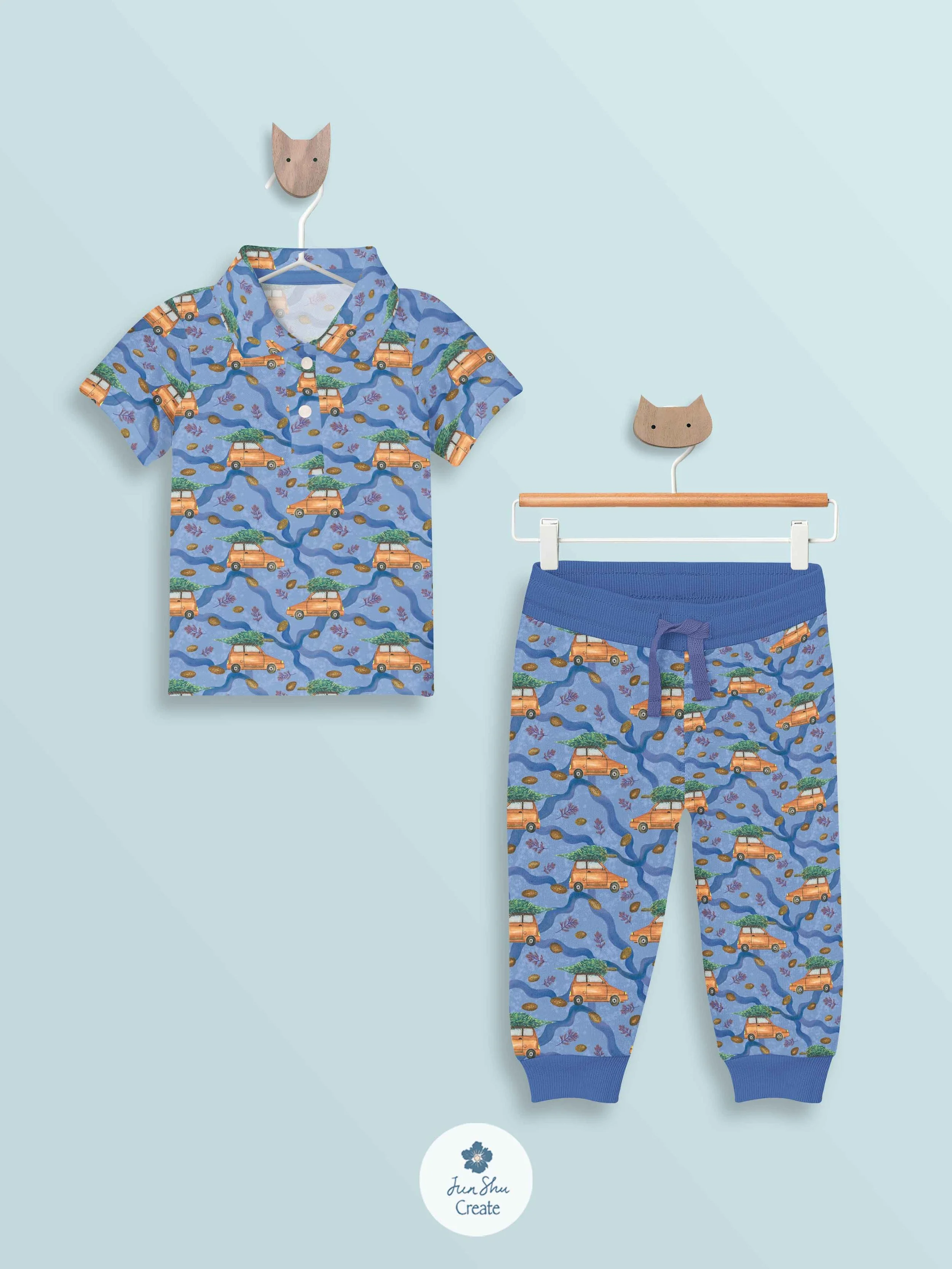
The star of the show is, of course, the hero prints. One is the winter floral bouquet, and the other is the Christmas tree on a red car. For the red car print, I saw this inspiration years ago and really liked how cute and cozy it feels. It was so fun to paint my own version. You can catch a glimpse of my painting of the tree here.
Boy’s PJ idea
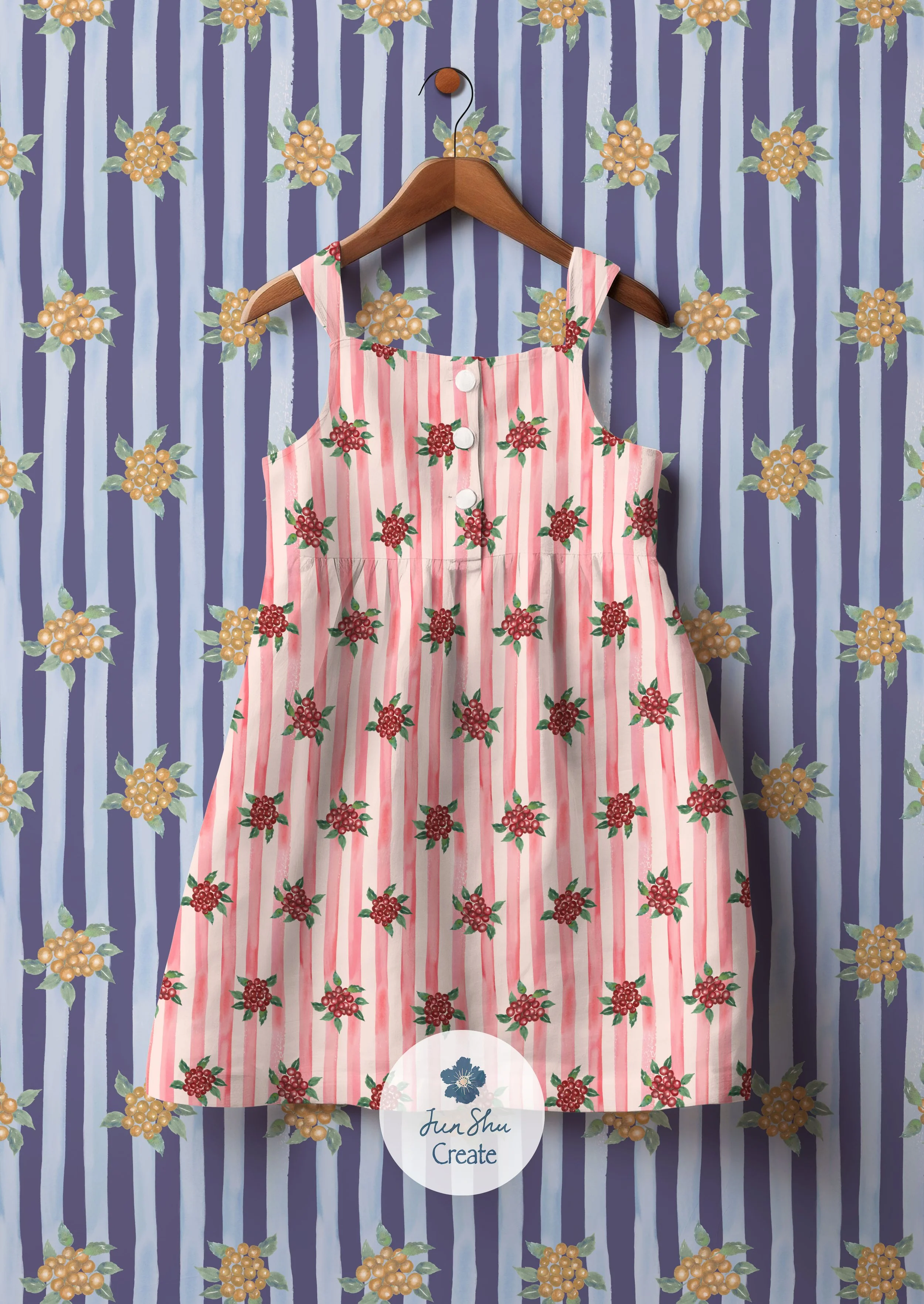
The winterberry-on-pink-stripe print is also one of my favorites. It’s a classic, versatile print, and I love how cheerful it turned out!
red winterberry on cheerful pink stripes
Do you like this collection? I surely hope you do! You can purchase the entire collection in two colorways on fabric, wallpaper and home decor by click the button blow! If you’d like to use the prints for your products, such as wrapping paper, greeting cards, notebooks or tech accessories, feel free to email me! ;)
Please share your A-Ha moment or any inspirations from reading this blog post in the comments, for it will encourage me to keep posting and other creatives!
I wish you a coziest holiday season with timeless, life-giving, beautiful art and designs all around you and your loved ones! If you haven't, be sure to sign up for my Substack newsletter to receive my updates, offers, and lovely freebies!
xoxo


